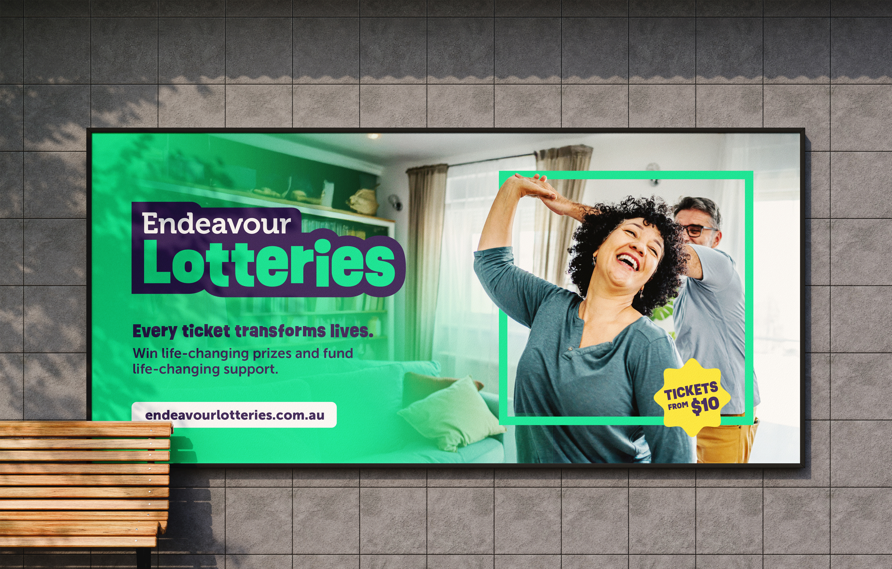
When every ticket tells a bigger story, the brand has to match it.
Endeavour Lotteries isn't just a lottery. Every ticket sold is a direct line of funding to Endeavour Foundation's disability services. So when the brand performs well commercially, a lot of genuine good is getting done in the world. That's a story worth telling well.
NWO has a longstanding relationship with Endeavour Foundation. When their lotteries division came to us for a full rebrand, we already understood what was at stake. The scope was comprehensive: brand strategy and positioning, plus full visual and verbal expression. The goal was to carve out a distinct and distinctive identity for Endeavour Lotteries in a competitive market, while ensuring the brand connection to Endeavour Foundation remained clear, coherent and compelling.
Challenge
Endeavour Lotteries is not a simple, single-product brand. Prize Home lotteries, Payday draws, memberships, the Ultimate Life Changer — at any given time, multiple campaigns are running concurrently, each targeting different audiences with different motivations and messaging needs.
The brand challenge was as much architectural as it was aesthetic. We needed to create an identity system flexible enough to give each product line its own voice and visual character, while holding everything together under one unmistakably Endeavour Lotteries umbrella. Add to this the requirement to clearly differentiate the Lotteries division from the Foundation itself — different audiences, different purposes, different tone — while keeping the relationship between the two brands intuitive and trust-building. It was a brief that demanded both system thinking and creative discipline in equal measure.
The spark
The answer was already in the brief. Endeavour Foundation had recently undergone its own rebrand — bold, bright and brimming with colour and energy. Rather than stepping away from that identity, we saw an opportunity to lean into it.
By building Endeavour Lotteries' visual language around the same vivid colour palette as the master Foundation brand, we could signal the connection instantly and emotionally.
The lotteries aren't just related to the Foundation, they fuel it.
Creative
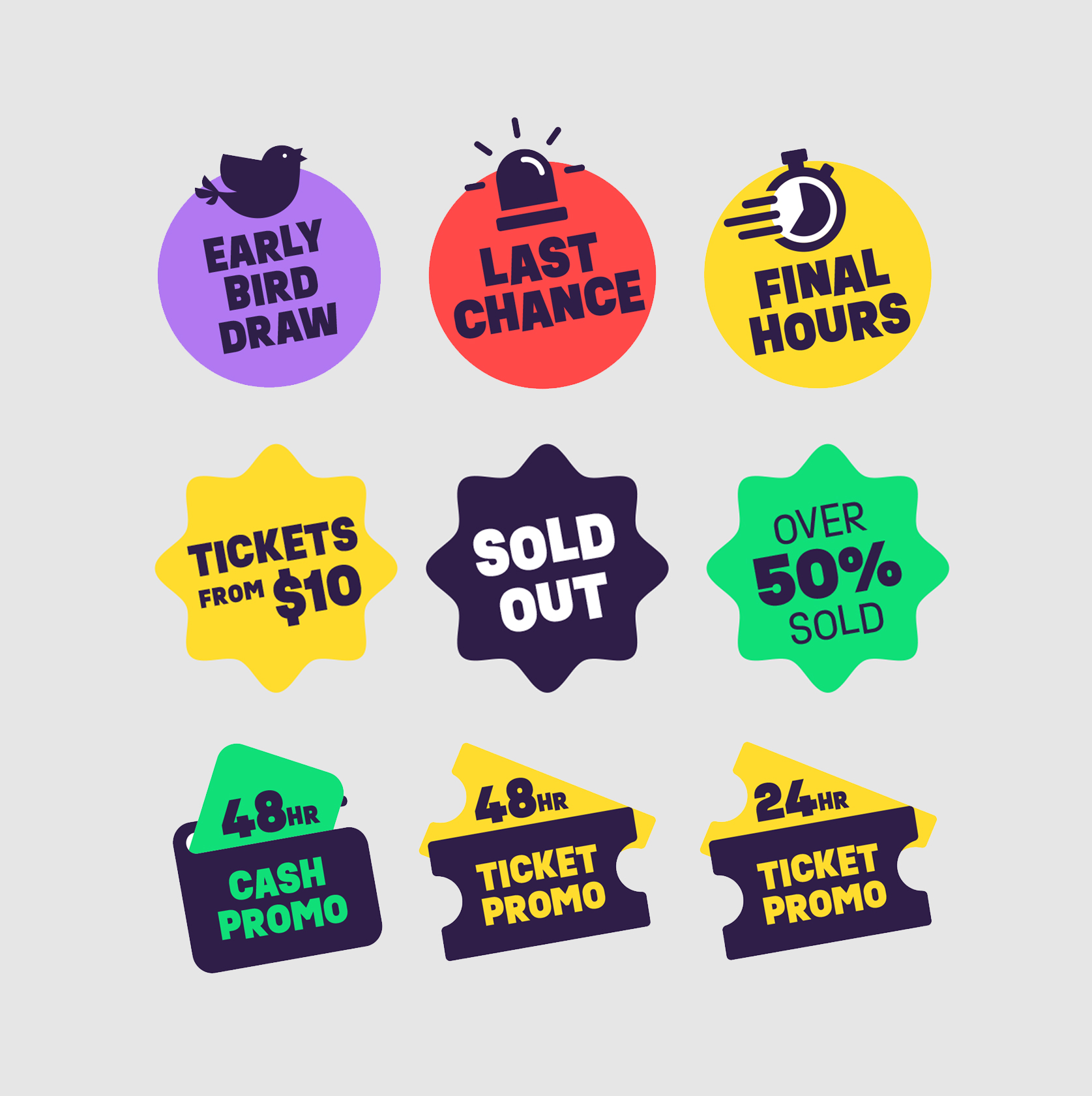
From there, the strategic challenge became one of variation within a system: how do you make each product feel distinctive without fracturing the whole? The answer was a set of defined visual tools that allowed the internal team to create with confidence and consistency.
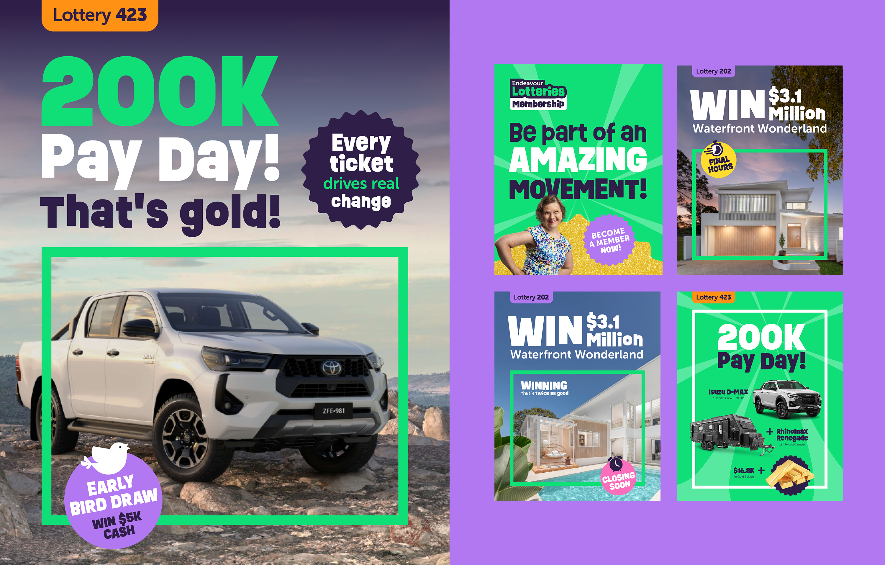
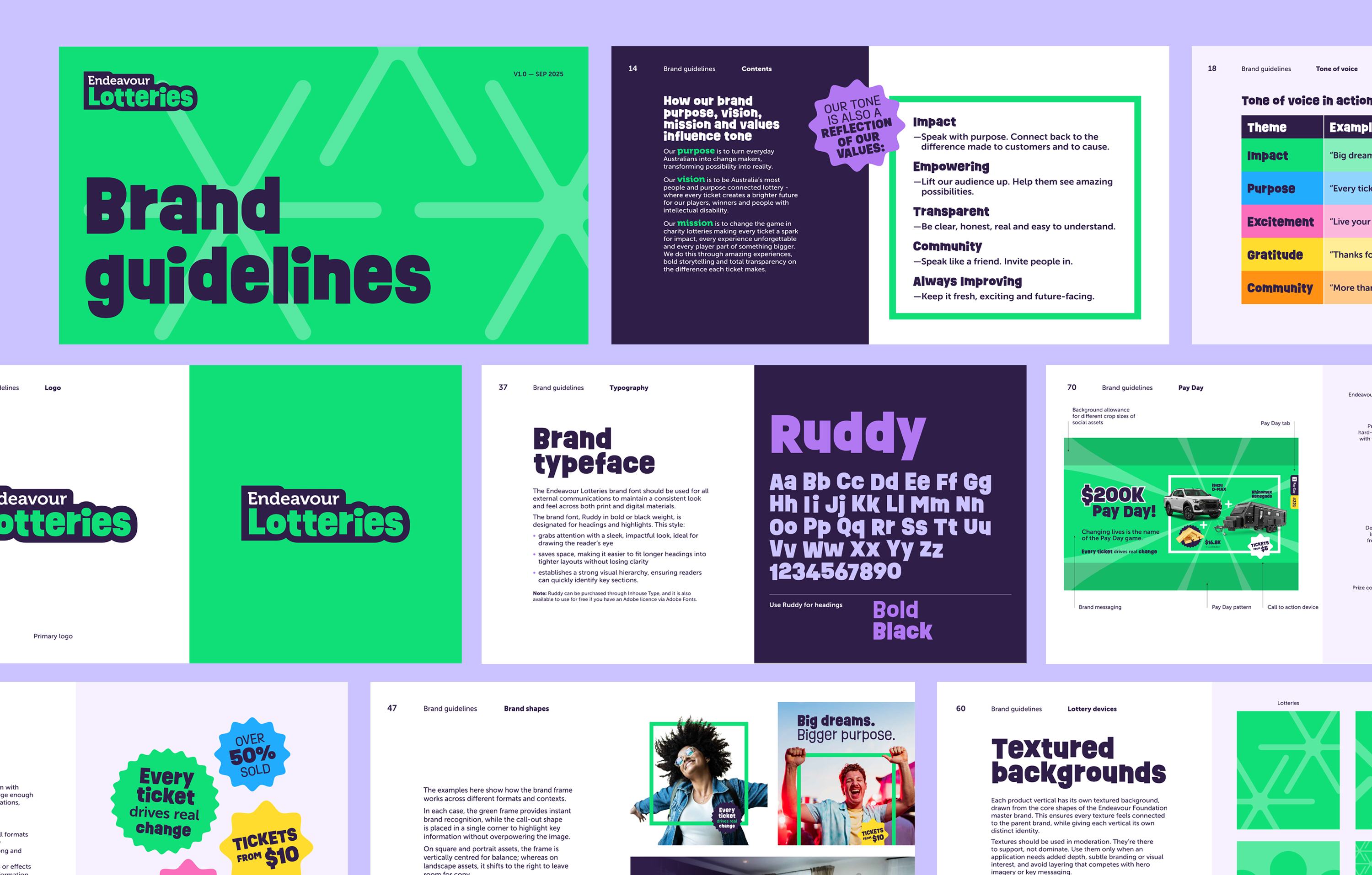
The creative solution was a modular brand system built around a strong core identity, with clearly defined visual conventions for eachproduct line sitting within it.
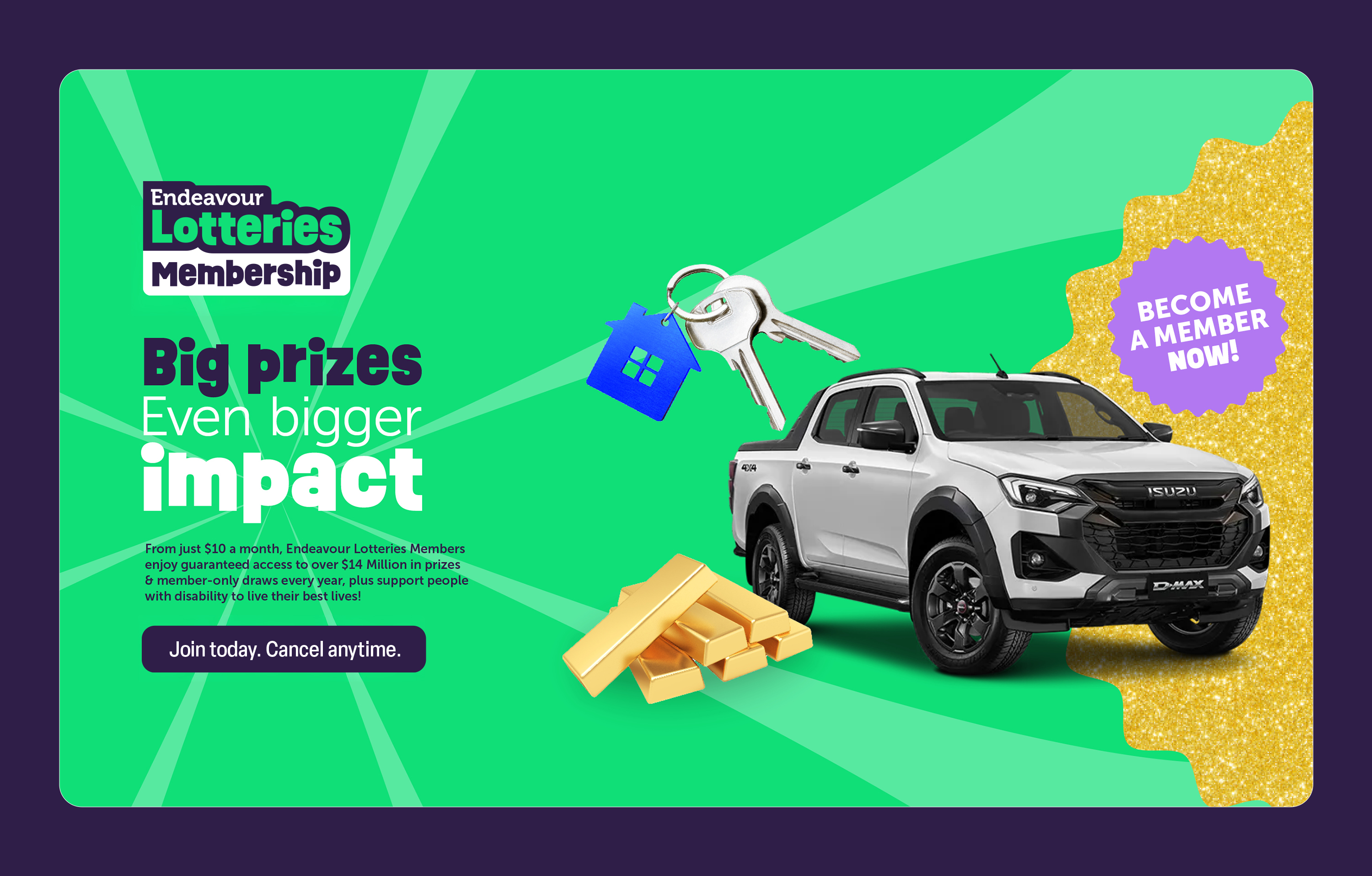
Membership carries a distinctive gold banner treatment. It’s immediately recognisable, premium in feel and reinforces the ongoing relationship between the supporter and the brand. Payday and Prize Home each has their own individual visual components: the specific shapes, typographic treatments and colour combinations that make them feel like distinct occasions, while remaining unmistakably part of the same family.
The power of the system is that it solves a real operational problem. With so many campaigns running simultaneously, an internal team needs more than brand guidelines — they need a toolkit. Clear rules, defined components and a visual logic that makes it easy to be consistent while still creating campaigns with genuine energy and distinctiveness.
The connective thread throughout is the Endeavour colour world which echoes the Foundation brand and, more importantly, echoes the feeling of what these lotteries make possible for people with disability across Queensland. The system works commercially because it also works meaningfully.



Outcome
The rebrand delivered a modern, cohesive identity with the flexibility to house every product in Endeavour Lotteries' portfolio while maintaining a clear, instinctive link to the Endeavour Foundation. Since launch, the internal team has taken the system and run with it, producing campaigns across all lottery products with remarkable consistency and genuine creative confidence.